Untitled Space — Paul Toornend
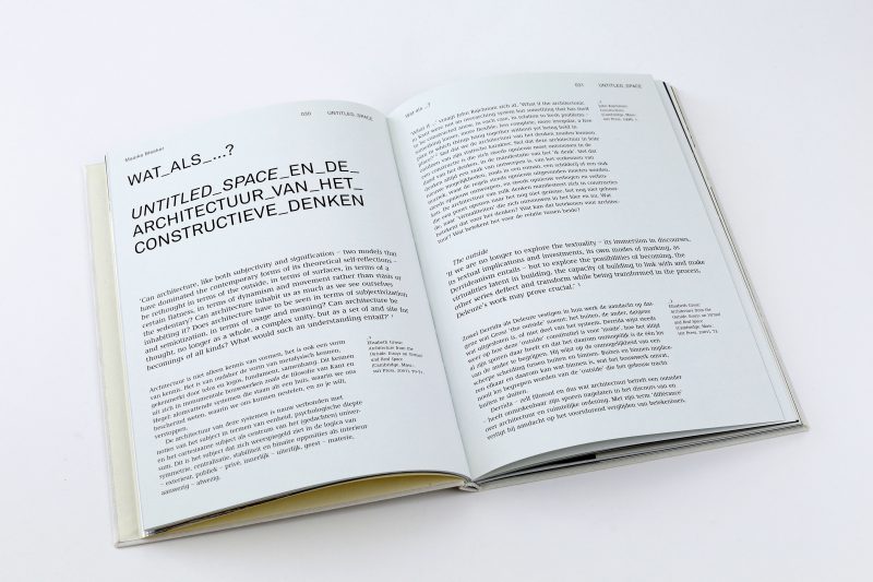
‘UNTITLED SPACE is everything that architectural history is not.’ So says architectural historian Vincent van Rossum of this Dutch project by Paul Toornend and Jelle Post. The project originated in 1995 to challange the traditional hierarchies and traditions of architecture.
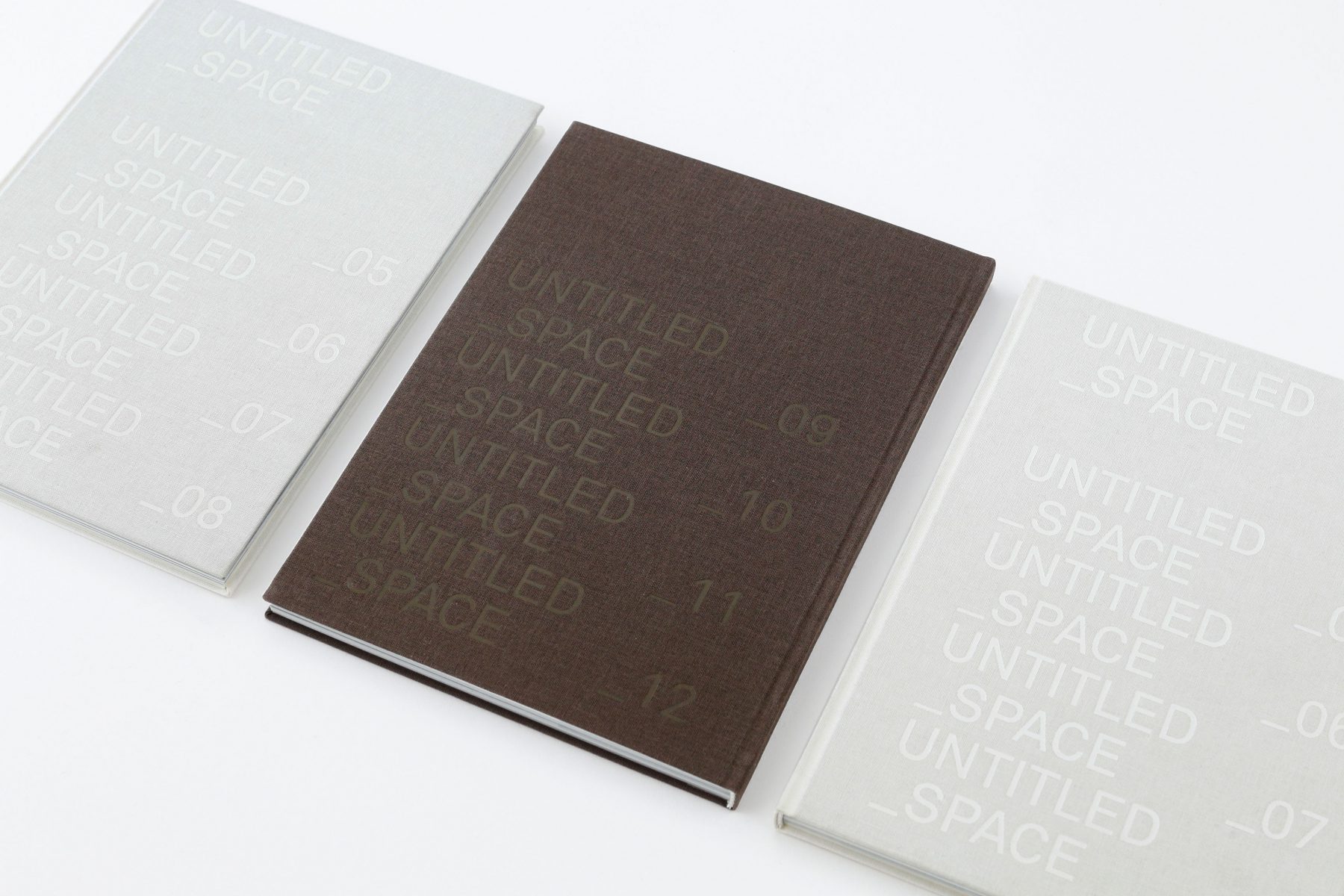
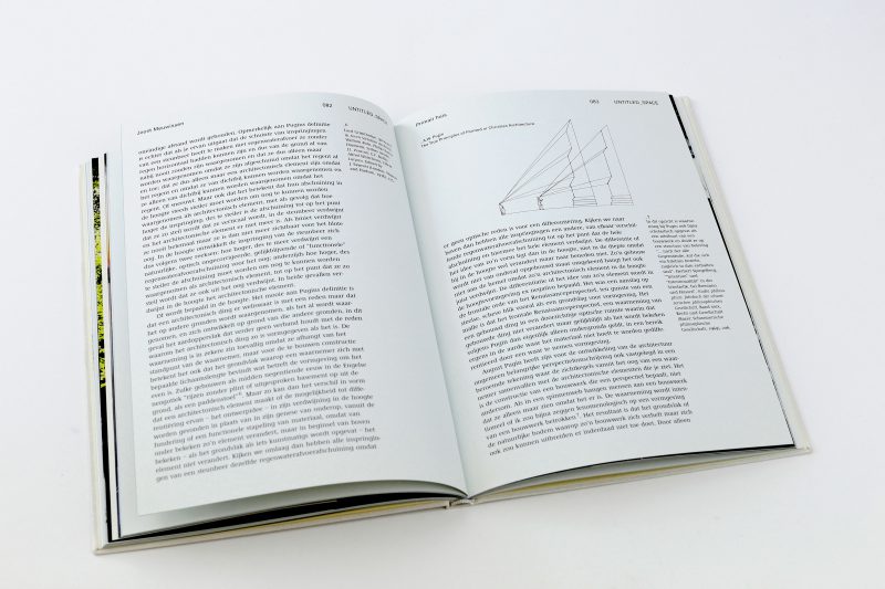
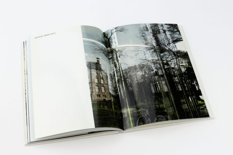
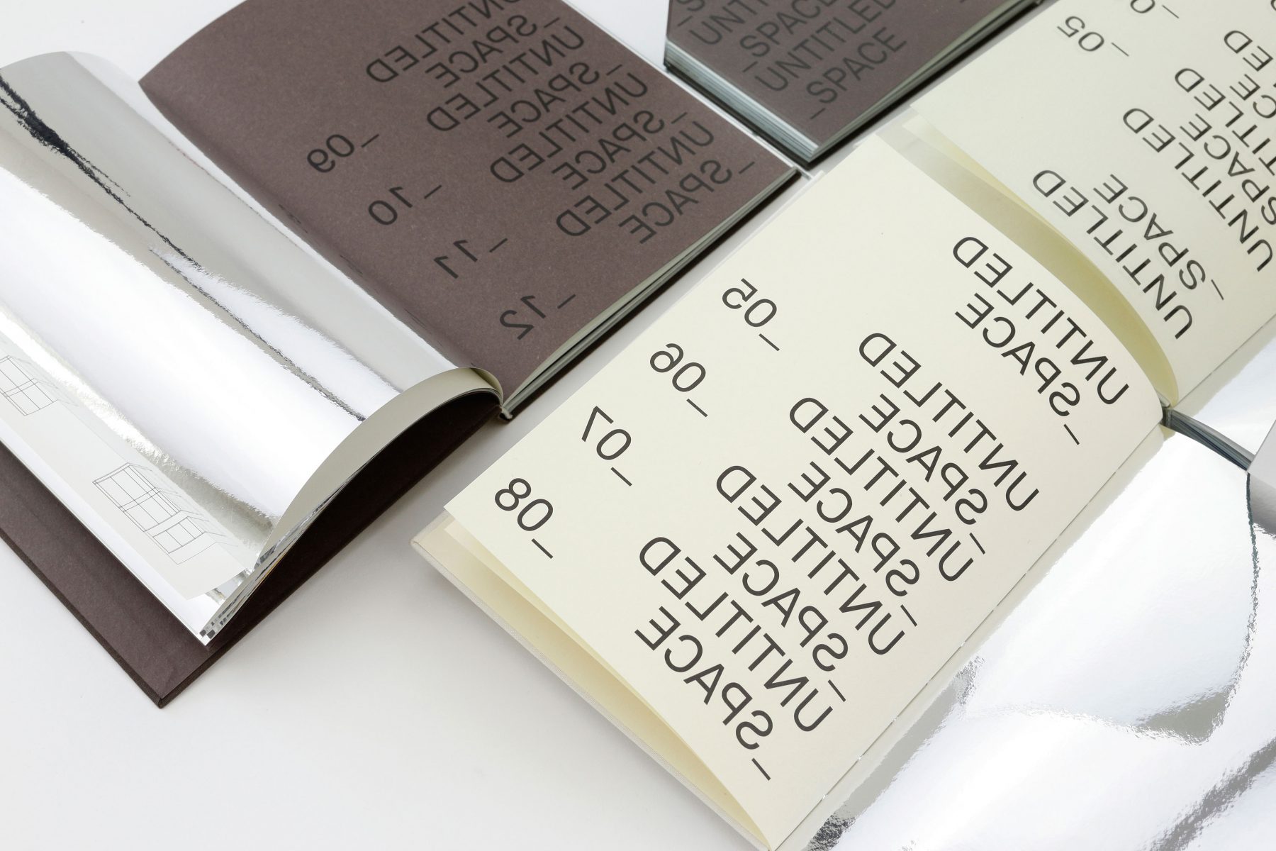
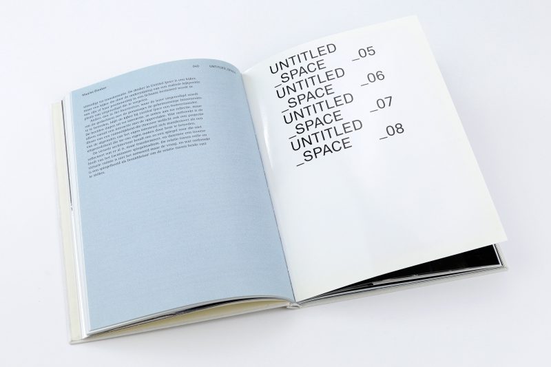
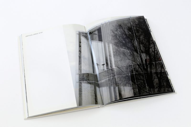
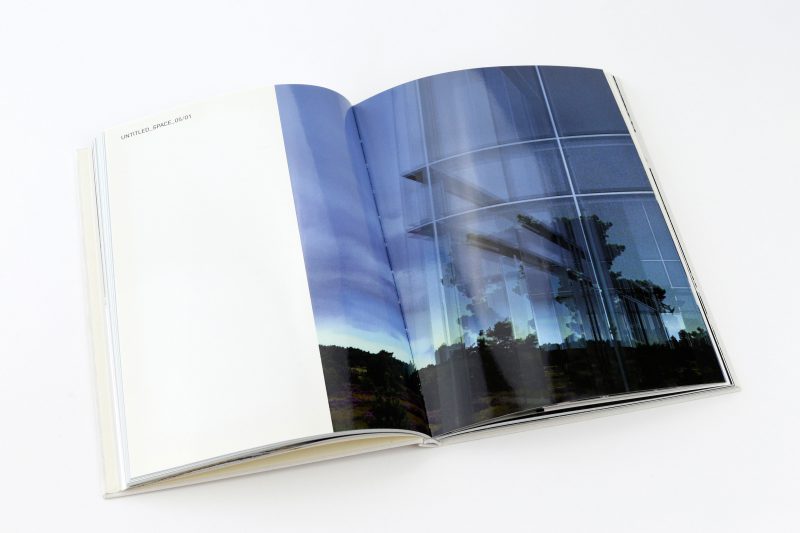
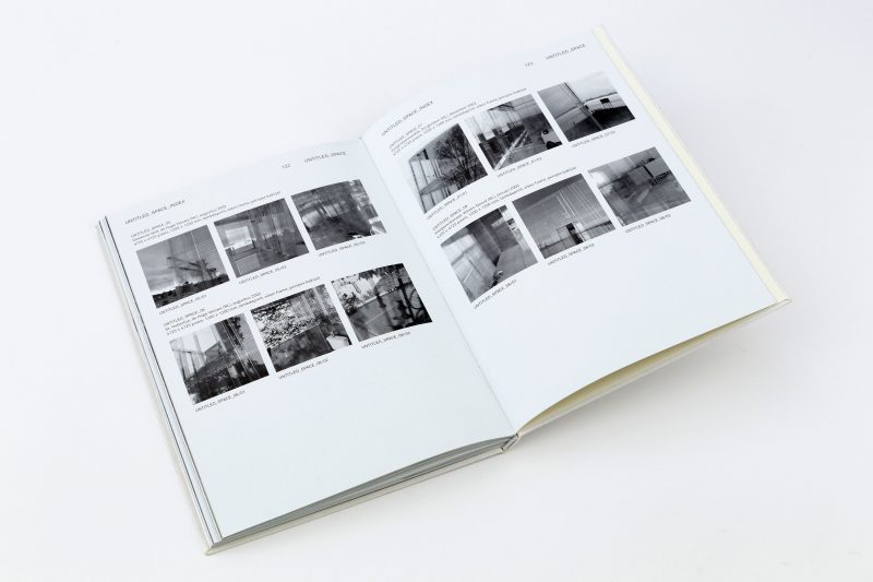
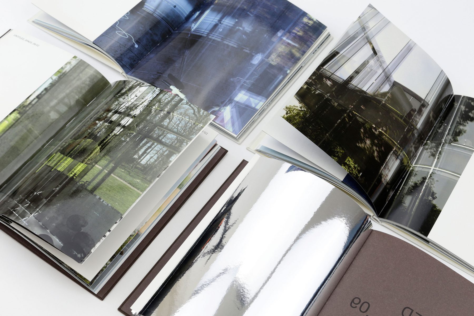
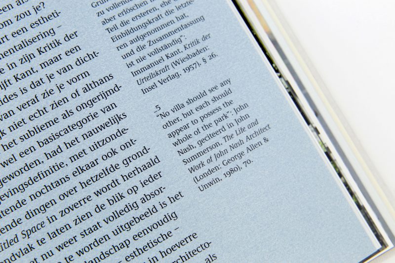
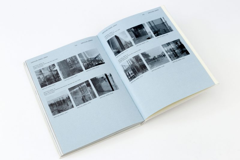
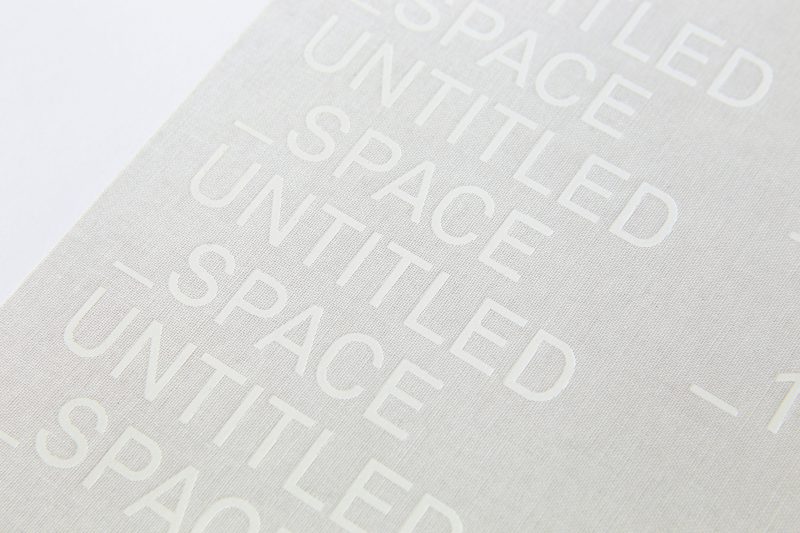
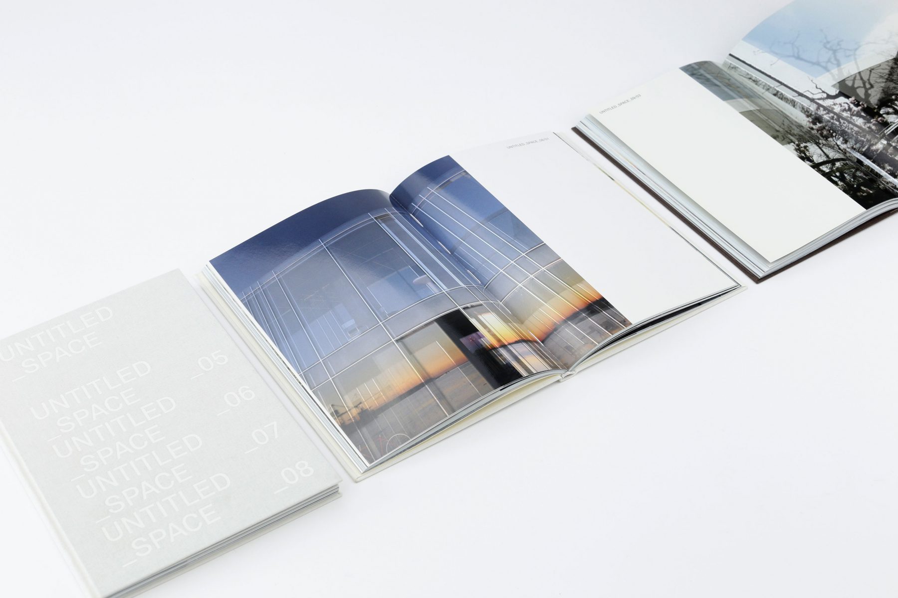
Amsterdam-based graphic designer Michaël Snitker has created a book to document the work that itselfs reflect the concept of UNTITLED SPACE. The built constructions of UNTITLED SPACE use mirrors to reflect and deflect the surrounding invironment and Snitker has done the same in the book with mirrored paper and varnisch in special sections. Elsewhere he has used Blue Back pearl-effect paper (usually used to print posters that are displayed in back-lit units) to evoke ‘rain on a glass window’. The typeface for the body copy is Demos, designed by Gerard Unger. The titles are typeset in Akkurat, a new sans serif typeface by Laurenz Brunner. ‘Because of the conceptual approach of the project I wanted to use a modern typeface next to a more classic, historical one’, concludes Snitker. ‘Both typefaces have lots of character but are not too forced’. — Grafik. Magazine 134, London
The publication was made possible by a grant of the Netherlands Foundation for Visual Arts, Design and Architecture.
128 pages | 225 × 165 mm | Dutch, English
Architectura & Natura Press, Amsterdam, 2005
Typefaces: Demos and Akkurat
Papers: Chromolux Alu-E Aluminium 80 gsm, Inter Affiche verso blue 120 gsm (special printed by Rosbeek), kunstdruk mat 150 gsm, Bakri Tek (brown) and Avorio (white) 120 gsm (cover) with Güth & Wolf 906 (silver)
Printer: Rosbeek, Nuth
Binder: Boekbinderij Van Waarden, Amsterdam
Binding style: sewn hardback wih foil stamping