Anna Achmatova — Avond
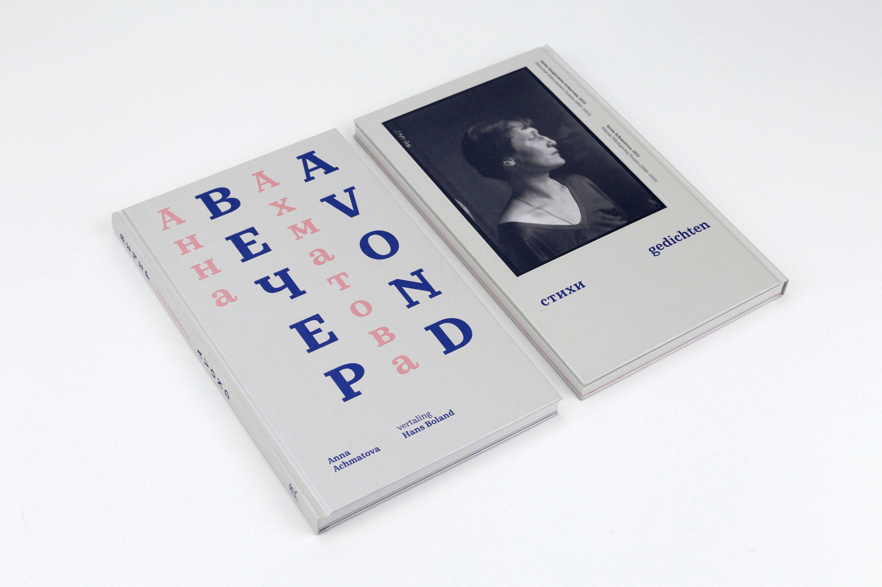
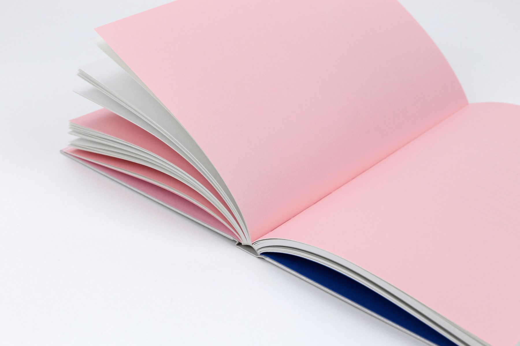
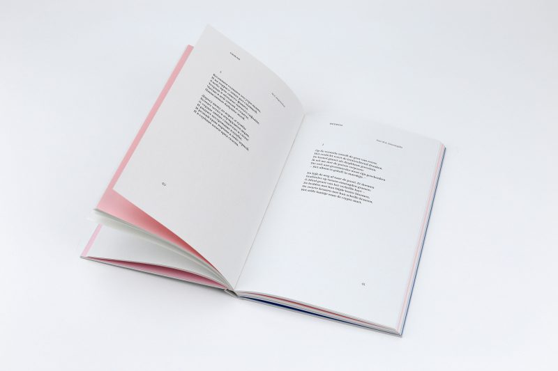
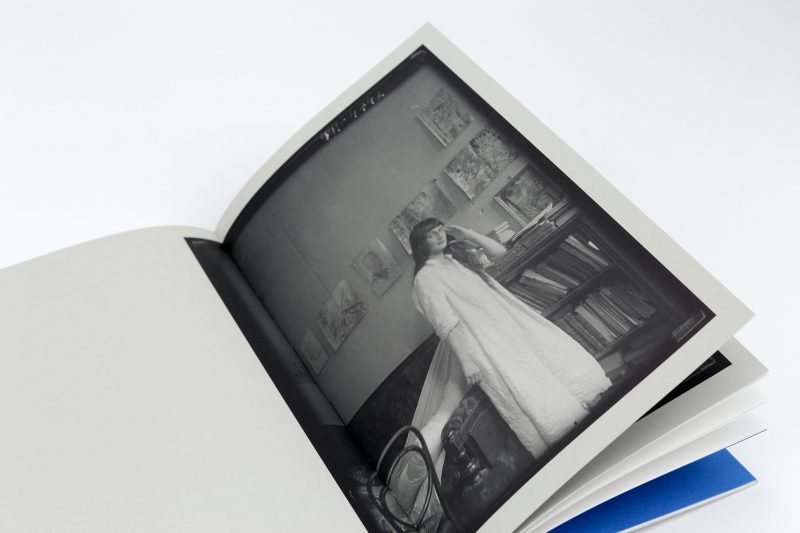
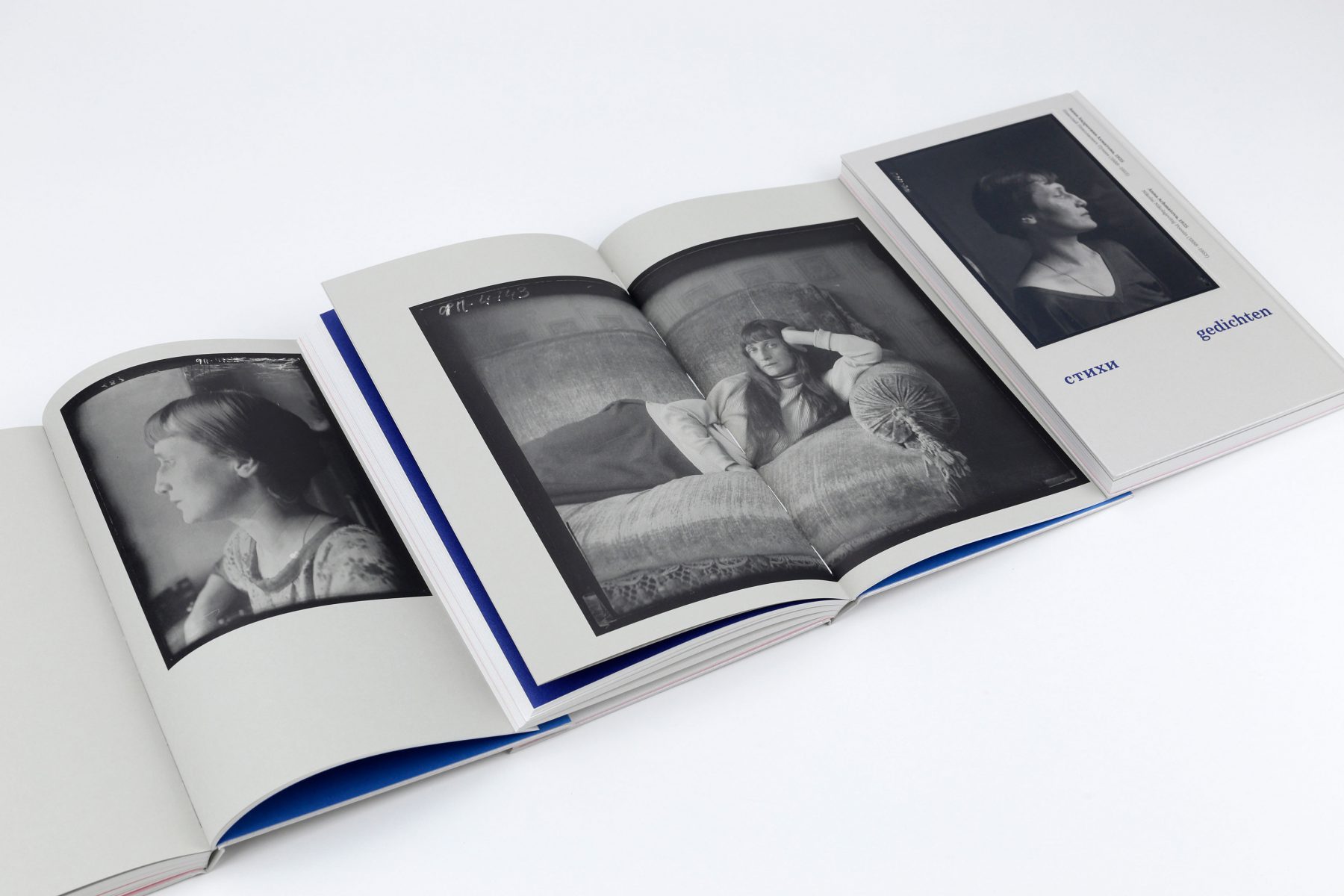
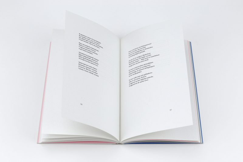
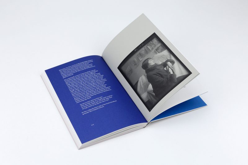
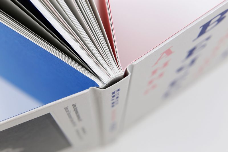
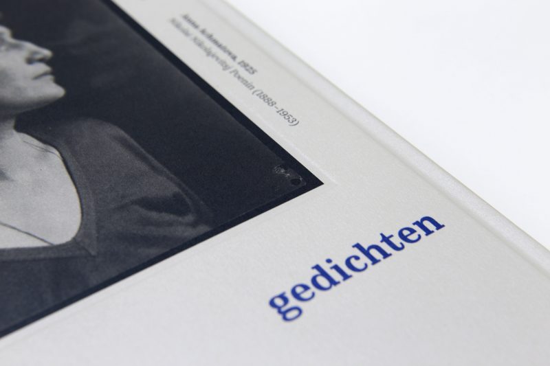
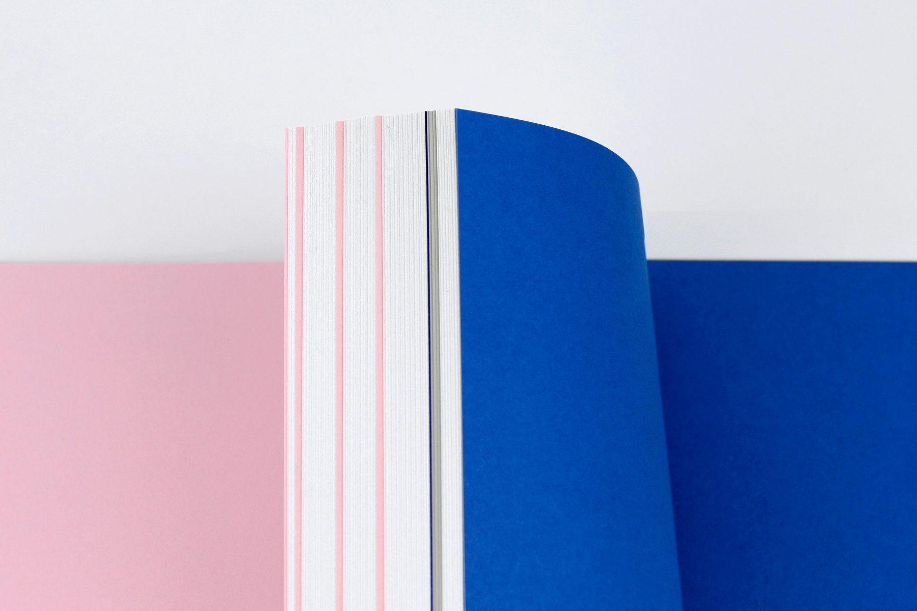
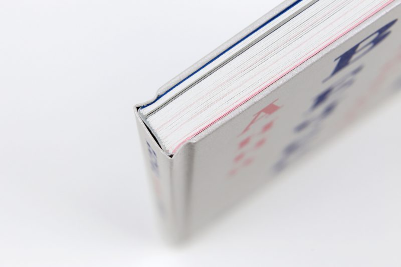
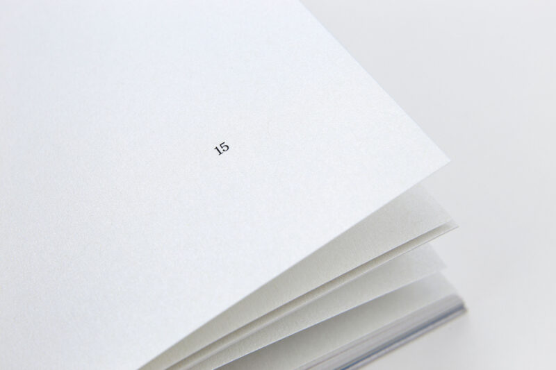
The writer Anna Achmatova bestowed particular glamour on the Silver Age of Russian literature. Her first volume of poems from 1912 has been published here for the first time as a translation into Dutch. The letters of the title are arranged one below the other: majestic, striking, airy. But the book catches your eye in other ways besides this vertical text. It is a physical detail that achieves even greater prominence: the elegant edges, extraordinarily narrow – so narrow that even the headband had to be omitted. The bilingual text (Russian, Deutsch) and the two scripts (Cyrillic, Latin) are a typographical challenge. The book designer does not succumb to tabular logic, but makes individual, plausible decisions on the front, spine, and back. The rear side of the paperback actually seems like a front cover: a photographic portrait of the writer that you would normally expect on the front or as a frontispiece, on a die-stamped surface. Subdued rose, darkened blue, recurring in the endpaper and separator pages, create a cool, classy colour scheme. The inner paper itself is responsible for the underlying atmosphere. In a soft light, it shimmers with a slightly silvery shine; when you turn it towards the light, larger sections of the paper gleam. The semibold, classical body type grants a sound footing for short verses or the few stanzas on the double page. The result: an editorial homage to the Russian poet from the Silver Age taking the form of book art. — Stiftung Buchkunst, Leipzig
The Museum of Anna Akhmatova in the Fountain House in St. Petersburg made on special request five new scans of the original glass negatives from 1925 on which Akhmatova is portrayed by Nikolai Poenin.
Awarded with the Best Dutch Book Designs 2017
debestverzorgdeboeken.nl
Awarded with Bronze Medal, Best Book Design From All Over The World in Leipzig
www.stiftung-buchkunst.de
128 pages | 150 × 240 mm | Russian and Dutch
Stichting De Roos, Utrecht, 2017
Fonts: Kazimir Text (Type.Today)
Papers: Curious Metallics Lustre 120 gsm, Pop’Set Grey 120 gsm, Colorplan Candy Pink and Adriatic 135 gsm (endpapers), Curious Metallics 100% Recycled Ice Silver 120 gsm (cover)
Lithographer: Lenoirschuring, Amsterdam
Printer: Lenoirschuring, Amsterdam
Binder: Van Waarden, Zaandam
Binding style: sewn hardback with a flat spine, thin boards with minimal square and blind debossing on back cover